Map coloring
Map coloring is a term used for two different concepts: In geography and mapmaking it is used to say that colors are assigned to certain areas on a map. Examples of this are coloring that show the countries or divisions of a country, but also to visualize other data, for example the altitude. The other use is in mathematics: There it is used to describe the problem of finding the minimal number of colors needed to color a given map.


In mapmaking
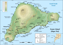
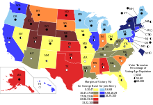
changeColor is very useful to show different features on a map. Typical uses of color include showing different countries, different temperatures, or different kinds of roads.
Displaying the information in different colors can affect the understanding or feel of the map. In many cultures, certain colors have certain meanings. For example, red can mean danger, green can mean nature, and blue can mean water, which can be confused with the sea.
Mapmakers may also use colors that are related to what they are mapping. For example, when mapping where it rains more or less, they may use different shades of blue. For a map of wildfires, they may use yellows, reds, and oranges. Carefully choosing colors is important so the map is easy to read and understand. Also, the mapmaker must take into account that many people have impaired color vision, and colors must be used such that these readers can see their differences.
Related pages
change